When to use
- To present multiple options that can each be selected.
- To offer help or error handling for simple settings.
- For changes that require confirmation after selection.
When not to use
- When only one of multiple options can be selected—use a radio.
- You want to group multiple options together into a single basic choice—use a choice group.
- For single on/off settings with an instant response—use a switch.
Component status
Figma | React | iOS | Android |
|---|---|---|---|
Released | Released | Released | Released |
Content structure

Behavior
Support progressive disclosure
While it makes sense to provide users with the information they need to make a good choice, providing them with too much information at once actually makes it harder to decide.
So while you might be tempted to stuff everything into labels and additional info, you should try to use progressive disclosure. This means using text links and tooltips to keep info hidden but close by.
Do
Present only absolutely necessary information with interactions to offer more.

Don't
Don’t overwhelm users with too much information at once.

Content
Write positive labels
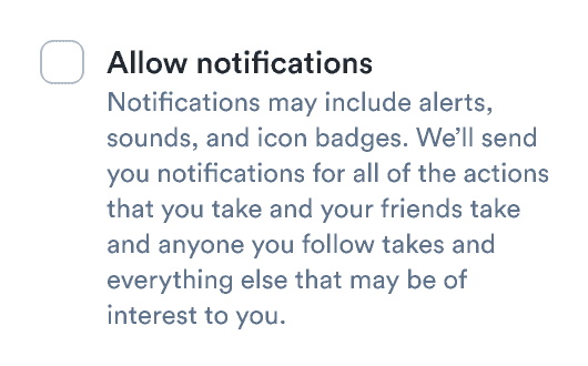
In addition to writing positively in general, you should especially focus on positive labels for checkboxes. Focus on what happens when the checkbox is selected. Don’t use the selected state for turning off features.
Do
Don’t
Use parallel labels
Whether you��’re offering filters for transport options, types of notifications to receive, or additional services to purchase, always present options using the same structure.
Do
Don’t