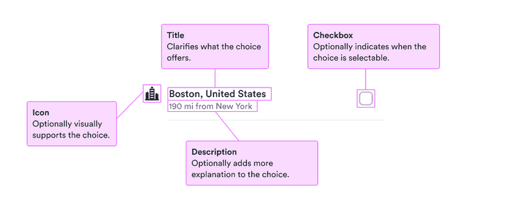
When to use
- To present similar choices with structured information to users.
- To highlight differences by using a consistent style.
- To add visual cues to choices.
When not to use
- For simple information without choices—use a list.
- For unstructured choices—use checkboxes or radio buttons.
- In small spaces when users can select only one option—use a select.
Component status
Figma | React | iOS | Android |
|---|---|---|---|
Released | Released | Released | Released |
Content structure

Behavior
Use for similar structured items
List choices work well at displaying items that are similar and have the same kinds of information. For example, use them to display a list of cities to travel to.
Seeing multiple options with similar information allows users to quickly scan for what they need to know.
Don’t use list choices when the information for each choice is very different. This slows down and confuses users.
Use separately
List choices work well when separated from the main flow, such as in a popover, modal, or drawer. They don’t work as well within the context of other information, such as directly in a form (they can be in popovers within the form).
When using within a container like a popover,
remove the extra padding added by the container
(such as by using noPadding for a popover).
Explain any disabling
Similarly as with buttons, it’s best to avoid disabling any potential choices. When users see things that look like actions but they can’t take them, they may get confused.
If it’s necessary to present a disabled choice, make sure users know why the options aren’t available.
Content
Categorize with icons
When you have a lot of similar structures, breaking them into various groups makes it easier for users to choose. To show things like stations with different modes of transport, use different icons for each mode.
Just remember that not everyone sees your visual cues, so include the same information in a non-visual way.
Add context with description
When the structure of each choice is similar, you can add additional context to the choices with the descriptions. For example, you can note how far each station is from the city center.
Just remember to keep the descriptions parallel so users can skim through and find the information they need (such as the distance).
The descriptions are presented as secondary text, so they should be used only for extra context and not vital information.