When to use
- To present a few options where only one can be selected.
When not to use
- When you have many options—use a select.
- When multiple options can be selected—use a checkbox.
- For single on/off settings with an instant response—use a switch.
- You want to group multiple options together into a single basic choice—use a choice group.
Component status
Figma | React | iOS | Android |
|---|---|---|---|
Released | Released | Released | Released |
Content structure

Behavior
Support progressive disclosure
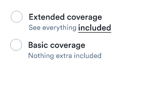
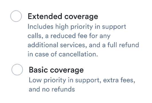
While it makes sense to provide users with the information they need to make a good choice, providing them with too much information at once actually makes it harder to decide.
So while you might be tempted to stuff everything into labels and additional info, you should try to use progressive disclosure. This means using text links and tooltips to keep info hidden but close by.
Do
Present only absolutely necessary information with interactions to offer more.

Don't
Don’t overwhelm users with too much information at once.

Show multiple options, but not too many
Radios force users to choose only one option. Make sure they’re always presented with two or more options. If you have many options to choose from, consider using a select to decrease the initial cognitive load on users.
Content
Use parallel labels
Whether you’re offering filters for transport options, statuses for requests, or types of special meals, always present options using the same structure.
Do
Don’t