When to use
- To offer users options within a clearly defined range.
- To offer a visually pleasing interface.
- To let users select a single value or a range of values.
When not to use
- To input single, large numbers—use an input field with the input mode set to number.
Component status
Figma | React | iOS | Android |
|---|---|---|---|
Designing | Released | Released | Released |
Content structure

Behavior
Present immediate feedback
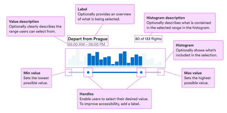
Users are used to seeing immediate results from interacting with sliders, such as from volume controls on phones and video players. Make sure they can see the effect of their choice of range.
Histograms help with this by offering a visualization of what’s included within the range. Just make sure the information is also included non-visually so everyone can access it.
Use for appropriate ranges
Sliders work well for many kinds of values. But if the range is too large (such as 0 to 1,000 counting by 1) or too small (such as 0 to 3), they start to lose their benefits.
For large ranges, try to break it into smaller pieces, or step up and down by a large number. For small ranges, consider checkboxes or selects.
Hide on small screens
When a screen doesn’t have enough space for a full slider, hide it initially behind a button. Popovers are great for disclosing sliders properly.
Make range clear
Users want to know exactly what they’re selecting from. So make it clear what the minimum and maximum of the range are.
The value description is the place to present this information clearly without it demanding too much attention.
Content
Use labels
Labels serve to clearly present what’s expected. They’re especially important for people who don’t see other visual cues. But they also help everyone know exactly what to enter.
For the label, use short descriptive phrases, ideally nouns that make the request clear. See our patterns for form labels for some examples.