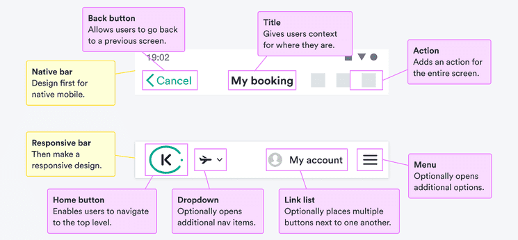
When to use
- To offer top-level navigation and branding (such as a logo).
- To keep navigation in a consistent place throughout the app.
When not to use
- For more complicated or lower-level navigation—use a drawer.
- For navigation within a screen or links in an app footer— use tabs.
- For lists of navigation links (in or out of a navigation bar)—use a link list.
Component status
Figma | React | iOS | Android |
|---|---|---|---|
Released | Released | Planned | Released |
Content structure

Behavior
Vary items by context
On large screens, it can help to have full ideas written out. Use clear nouns to describe what each menu item means.
Do
Don’t
On smaller screens, there’s not space for many words. Use icons to communicate the main ideas. Just remember to include text equivalents so everyone knows what the items mean.
When using icons, keep them aligned to the side without large gaps in between.
Collapse menus in smaller contexts
When you have complicated navigation but only limited space, use progressive disclosure. Keep most items hidden at first and offer dropdowns and drawers to reveal them.
Make sure users know how to open the items. Use common patterns like a menu icon to make it clear what’s possible.
Content
Keep app bar clean
In mobile apps, the navigation bar can’t hold much. It’s not the right place to hold menus or other complicated options.
If you want to add links to options in an app, consider using a tab bar in the footer.