When to use
- To break users out of their flow to complete an action.
- To present simple choices or small bits of information.
When not to use
- You have more complex or structured information—use a modal.
- To keep current screen in focus or not block content on wide screens—use a popover.
- For temporary messages without actions—use a toast.
Component status
Figma | React | iOS | Android |
|---|---|---|---|
Released | Released | Released | Released |
Content structure
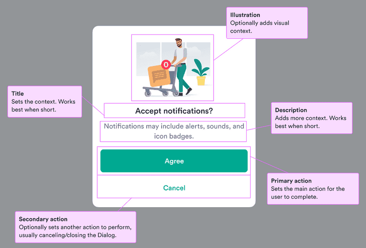
Behavior
Open on user action
Dialogs are disruptive to the main flow. Only start one after the user has taken an action so it’s clear why it was triggered.
Allow users to close
Users want to feel in control of their actions. Since dialogs interrupt the main user flow, they can invoke negative feelings in users. Make sure users feel in control by offering them a clear option to cancel the dialog and get back to the main flow.
There are situations that all users need to complete before continuing (like accepting terms for an additional service), but it should still be possible to go back to the previous point in the flow.
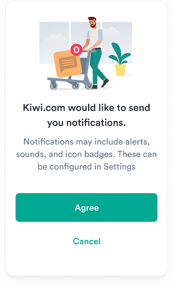
Do
Give a cancel option.
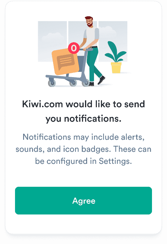
Don't
Don’t force users to accept only one option.
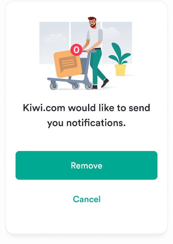
Warn about destructive actions
If the action related to the dialog is irreversible or removes something, use a critical button to make the consequences clear to users.
Do
Warn about destructive actions.
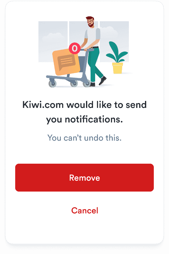
Don't
Don’t offer destruction choices with no warning about the consequences.
Content
Keep it simple
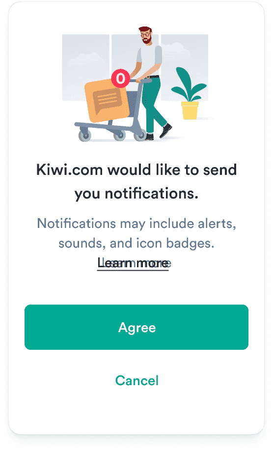
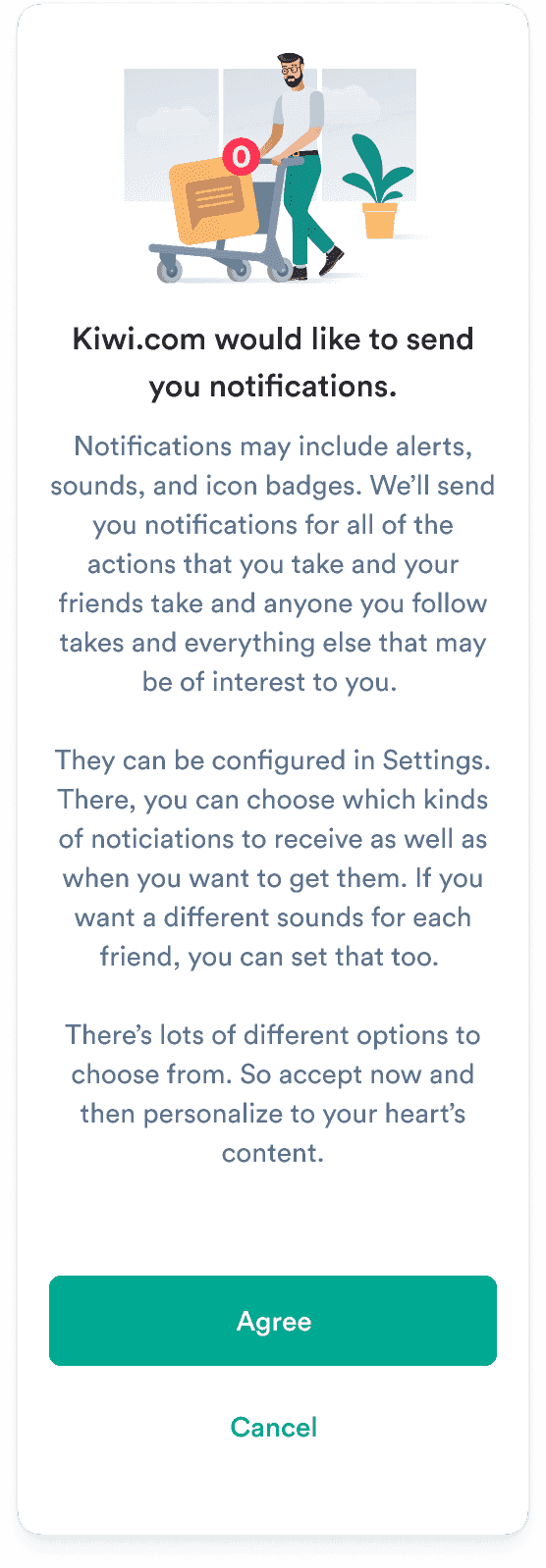
Dialogs are best as single actions where the context is clear and doesn’t need a lot of explanation. Don’t overwhelm your users with information.
Minimize information
If more information is absolutely necessary, consider adding a text link.
Do
Don't
Make action clear from title
The title should make it clear what action users are expected to take or what they’re agreeing to. Keep it short and save any details for the description.
Do
Don’t