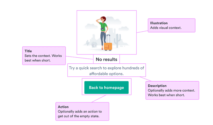
When to use
- When a user action has no results (such as a search or unfilled data).
- To provide guidance on how to get out of the empty state.
- To present a negative situation in a positive light.
Component status
Figma | React | iOS | Android |
|---|---|---|---|
Released | Planned | Released | Released |
Content structure

Behavior
Guide users out
Empty states can feel nicer when they have illustrations and friendly messages. But don’t forget that they’re not an end goal in themselves.
Help users get out of an empty state into a place they can actually do something. Highlight the actions a user can take to move forward in their desired path.
Focus on simple actions to take to achieve a goal.
Content
Stay positive
Remember that an empty state isn’t a desired outcome, so try to encourage users to continue with helpful language and a positive illustration. Guide them to the next step to take to get to their desired goal.
Use humor carefully
Empty states can be stressful for users because they want to get something done and can’t. Maybe they want to find a connection, book a trip, or start a new project, but all they have is an empty state.
While humor can lighten the mood, remember that we keep our tone more serious in stressful situations. Especially stay away from anything that might look like blaming the user for the empty state or making it seem impossible to get out of.
Do
Guide users out of the empty state into their happy state.

Don't
Don’t blame users for the empty state.

Make nonvisual info clear
Illustrations in empty states are just for decoration. This means they don’t need to have alternative text embedded in the image.
Instead, focus on making the title and any other text clear on their own so the message of how to get out of the empty state is accessible to everyone.