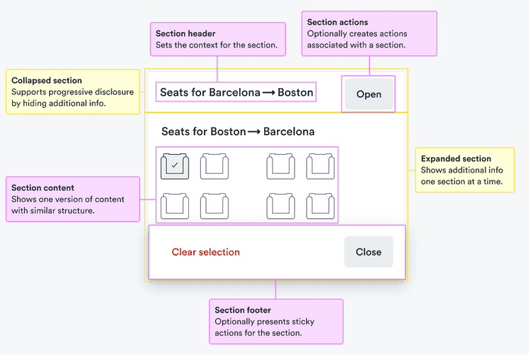
When to use
- You have long sections of content with similar structure, such as seat maps for various parts of a trip.
- You want to show only one section at a time (to keep users from being overwhelmed to support progressive disclosure).
When not to use
- You want to display all content on the screen at once—use a card.
- Each section has a single associated action—use a tile.
- The information to hide is simple and doesn’t have a repeating structure—use a collapse.
Component status
Figma | React | iOS | Android |
|---|---|---|---|
Designing | Released | N/A | N/A |
Content structure

Behavior
Make actions clear
Accordions make content appear and disappear on the screen. If you’re not careful, users may start feeling lost.
Offer clear, persistent actions that make it clear how to get from one section to the next. And how to get back anything that has disappeared.
Content
Use for similar content
Accordion sections aren’t visible all of the time. Users may experience navigating between them as switching context.
Keep users comfortable by offering similar content in each section. This helps users scan for what they need among all their options.
Offer concrete headings
Section headings offer context for what each section contains. Use specific nouns to make it clear what users can expect on opening the section.
Visual style
Maintain visual hierarchy
Accordions are open to any content you want to put into them. Make sure to use a consistent style of heading to keep the overall visual hierarchy.
Using different styles can create conflicting visual messages.