When to use
- You have simple pieces of information that are related or have a similar structure.
When not to use
- You have more complex, tabular information—use a table.
- There are choices connected to the information—use checkboxes or radio buttons to enable interaction.
- You have complex structures with choices— use list choices.
Component status
Figma | React | iOS | Android |
|---|---|---|---|
Released | Released | Released | Released |
Content structure

Behavior
Use when order doesn’t matter
The list component presents information as unstructured lists. Don’t use it when the order of the items matters, such as a list of steps in a process. Instead, use an ordered list.
Content
Use for similar items
Lists are good at making more complex information easy to scan. This works well when you have multiple items with similar information.
They aren’t designed to emphasize details. So don’t use them when you only have one item to set off from surrounding text.
Do
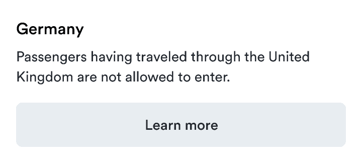
Use paragraphs for single items.

Don't
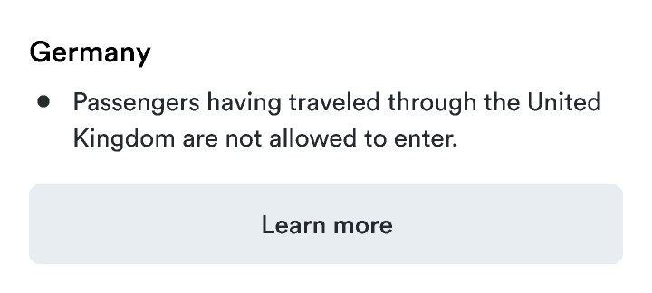
Don’t use lists for emphasis.

Similarly, while lists provide a visual break, they shouldn’t be used just to break up long paragraphs. If you don’t have information that can be broken into similar pieces, break long paragraphs into shorter ones but don’t use a list.
Do
As the passenger, it’s your responsibility to ensure you have the correct visas and travel documents for your trip.
You should carefully check which countries you’re transiting through before making your booking. A visa is generally required even for transit or rechecking your baggage.
Don’t
Use parallel structures
Each item in the list should be phrased in a similar way. This consistency helps users scan to find the information they need. Varying the structure makes it harder to understand.
Do
Don’t
Look & feel
Use icons sparingly
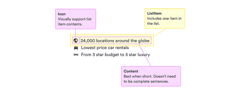
Icons can help add emotion to your lists, such as checks in colorTextSuccess when listing features. They can also make details easier to scan, such as the icons in the content structure.
But too many different icons can draw too much attention and overwhelm users. Only use them if they provide clear value and don’t distract too much from important actions.