When to use
- To help travelers know what to expect at airports.
- To provide visual context for specific airports.
- With all essential information in text to be accessible to everyone.
When not to use
- For general situations not connected to a specific airport—use an illustration.
Component status
Figma | React | iOS | Android |
|---|---|---|---|
Released | Released | N/A | N/A |
Content structure
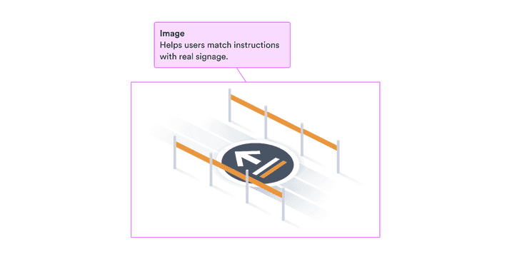
Content
Present info nonvisually
Illustrations can add a lot to your designs. So you need to make sure everything necessary is presented to people who don’t see the illustration as alternative text.
Meaningful alternative text includes the context and function of the illustration. Make sure everything you want users to know to continue in the flow is available to them.
You can include alternative text through means like the alt attribute.
Or you can present necessary alternative text next to the illustration
as text or headings,
in which case you can set the alt attribute to an empty string.
If an illustration is only for decoration, leave the alternative text blank. Providing a description just gives users extra information that doesn’t help them.
Do
Use meaningful alt text
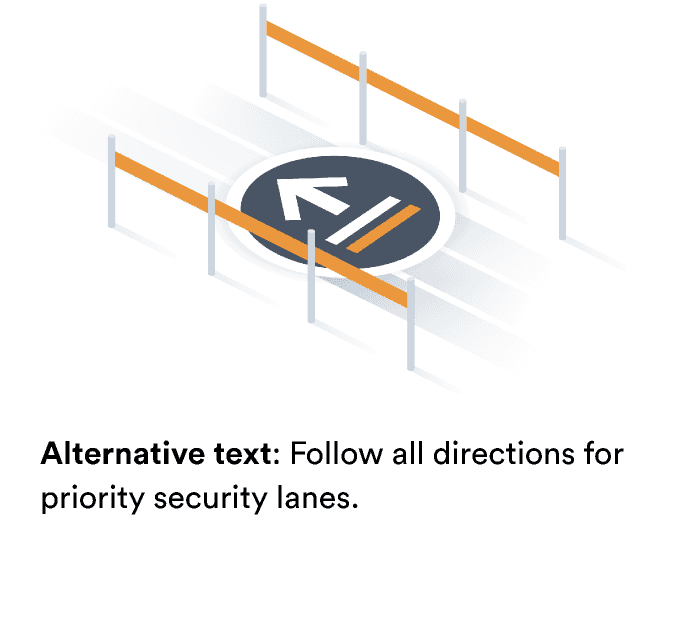
Don't
Don’t repeat unnecessary information.
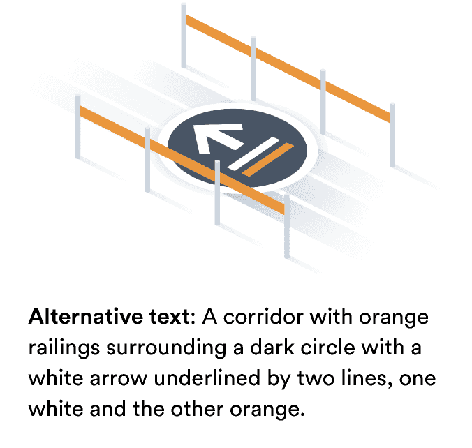
Look & feel
Airport illustration types
You can set two things about illustrations. The first is the illustration itself, which you can choose from the complete list of illustrations.
The second is the size. We have five different sizes to offer, which are based around the maximum height of the illustration.
- Extra small (90px)
- Small (120 px)
- Medium (200px)
- Large (280 px)
- Display (460 px)
Available illustrations

BGYFastTrack

BUDFastTrack

MRSSmartPass

NCEFastTrack
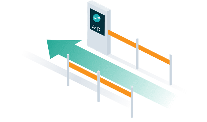
PRGSmartPass

VCESmartPass