Our vision is to provide the tools needed for building incredible travel products.
From a Kiwi.com perspective, Orbit aims to bring order and consistency to Kiwi.com products and the processes behind building them. We elevate the user experience and increase the speed and efficiency of how we design and build products.
We opened our design system to everyone. As a company, we believe that by giving people resources to create travel products easily, we all will make travel better. Together.
Although the components are the core of Orbit, we’re not just another component library. We took years of experience of building travel products and baked it into our components, from accessibility and internationalization to advanced theming and travel-specific components.
Principles behind Orbit
These are the values we use to build and maintain Orbit.
With absolute honesty, Orbit isn’t currently fully compliant with some of our principles, but we’re working on it every day. These principles help us keep on track and stay focused on the right things.
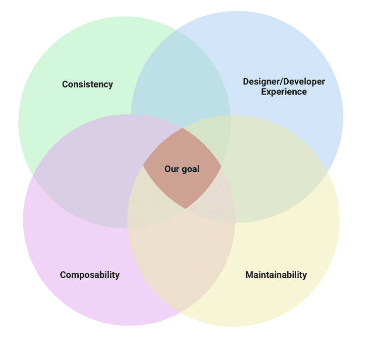
Find the best middle ground
There are 4 key aspects when working on Orbit. Our goal is to meet somewhere in the middle—so everything we do isn’t just consistent or composable, but improves the work of our designers and developers and is maintainable in the long-term.

Be transparent
Transparency is the key to success. That’s why we have a public roadmap and open feedback channels. But we’re trying to go further. We document our design decisions so we can reference them in discussions and not reinvent the wheel again by discussing stuff repeatedly and without historical context.
Listen and react
The first and most important part: nothing in Orbit was done without research. Listen to users, actively ask for feedback, and act on users’ needs. When answering, provide enough context. Don’t let people wait for our answers. Their job may be blocked by Orbit and they may rely on us to help them.
Make things intuitive
Not many people read the documentation. Our goal is to make everything as simple as possible, ideally self-explanatory. We believe that consistency is followed closely by clarity. We encourage experimentation. We welcome new solutions. But our focus is on using patterns and vocabulary that are familiar to our users.
Give consumers just enough control
The priority for Orbit consumers is to always deliver the feature they need to work on. And they expect Orbit to be a tool that just works. Give consumers delightful components and provide enough flexibility in how to assemble them for the specific use case they have. Ensure consistency in visual interactions, but allow consumers to extend components by their own actions.
Guide with documentation
We decided not to document obvious things such as the visual style of components. The purpose of our documentation is to be a partner who helps solve a problem when people build with Orbit. We always aim to make our documentation available at the right moment and in the right context.
Set appropriate defaults
The best scenario is when consumers take our component and it works. There is no need to dive into the deep waters of the documentation for simple properties or to understand how a Figma variant works.