Almost every airline, bus, or train carrier has its own logo and colors. For some of them, the brand is important for being recognizable, while others are less known. For us, logos matter.
tl;dr: Here is the Photoshop template you may be looking for.
People ❤️ brands
Travelers are especially interested in travel brands. That’s the main reason we carefully prepare logos for those carriers that appear on Kiwi.com—to help people quickly realize who they’re traveling with.
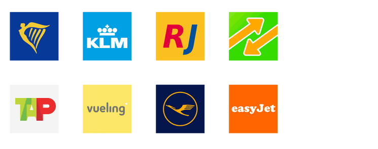
How many of these logos are you able to identify just from this screenshot? Two? Three? Are you a seasoned traveler from Europe? Maybe you recognize all of them.
1st row: Ryanair, KLM, RegioJet, FlixBus;
2nd row: Tap Portugal, Vueling, Lufthansa, easyJet
We believe that it’s not enough to just mention the brand name in some small text in the caption. We want to provide information that helps people quickly recognize their favorite airlines. Using well-crafted logos helps us achieve this (and it looks great too 🥳).
Having a nice logo isn’t rocket science
We wrote these simple guidelines to help you prepare logos well. For functionality and recognition.
It’s actually pretty easy. Anyone can do it following these two simple steps.
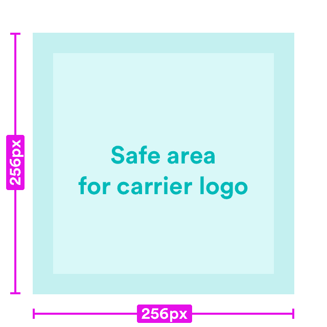
1) Set the size to 256×256 pixels
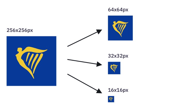
If we have the logo available in 256×256 pixels, we can resize it automatically for different screens and sizes. That’s how we display the best possible logos to our users.
It’s always better to work with a bounding box (that space around the edges). It gives your logo a bit of room to breath.
An image is worth thousands words:

To make it even easier, we’ve prepared a Photoshop template for you. You just need to save your logo as a PNG and upload it to Nest 🙂
2) Use a solid color for the background

The carrier logo is usually placed on a white background, so we try to use a solid brand color on the background. Even if that means that we occasionally invert the logo colors.
There are two main reasons for this practice:
- It gives each logo a unified rectangular shape. If there was a white background, each logo would have a custom shape. It would be distracting and draw unwanted attention.
- It makes the logo stand out a bit from the interface. Like using photos in your designs—they pop!— beautiful and bright logos can bring some emotion to our interface.
One last thing
Orbit takes care of all UI styling, so there’s no need for round corners or transparent background.
Just create a logo according to our guidelines above and upload it to Nest. Automatic resizing and Orbit handle the rest. Sounds good, right? 🙂