This guide is for Kiwi.com employees. For everyone else, we offer an open-source guide.
Figma is where all of our design can happen collaboratively in one place. Instead of different tools in different domains, everyone can take advantage of a unified process to focus on creating the best experiences.
All of it focuses on the principle of designing first for native mobile implementations. From this seed, all of the other designs grow.
We’ve broken the process down into various parts so you can focus on what you need to know. Get started by logging into Figma and finding your team.
If you run into any issues, #plz-orbit in Slack is your one-stop answer shop.
Logging in
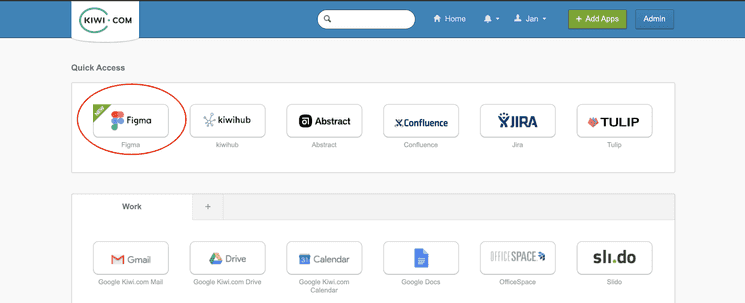
To get going, log into Figma using Okta. The easiest way is to click the Figma logo from the Okta dashboard.

If you don’t see the logo, you can request access in #plz-access and tag @will.
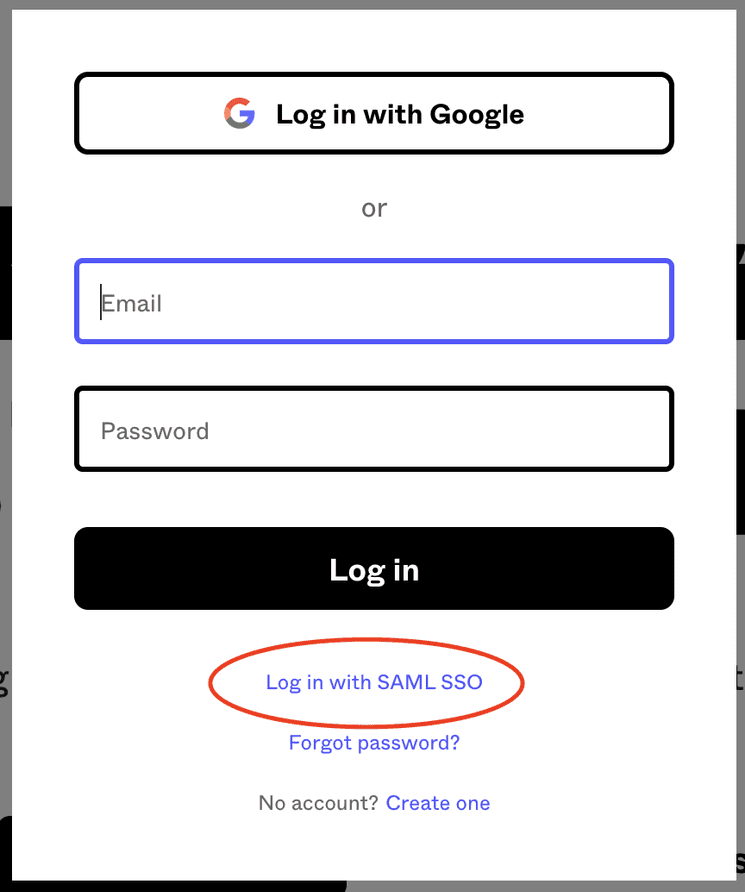
You can also log in directly with Figma.
- Go to figma.com.
- Click Log in at the top of the page.
- Choose Log in with SAML SSO.
- Enter your Kiwi.com address and click Log in.
- Enter your Okta details as necessary.

Now you’re inside the Kiwi.com organization. Anyone with a Kiwi.com email address is automatically a member of the organization and can view all designs. Now you need to find the designs relevant to you.
Joining teams
If you’ve never logged into Figma before, you see an overview of the teams available to you within the Kiwi.com organization.

Teams are the top-level organizational unit within Figma and are created based on domains, such as the Kiwi.com App and Web teams. Anyone with a Kiwi.com email address can join any team they like and view and comment on all designs within it. So join the teams with designs you’re interested in.
Why are our app and website split into two teams?
At first glance, it might seem confusing that we’ve split the Kiwi.com organization into separate teams for mobile app and website designs. And why are designs for the app separate from our responsive designs for viewing the website on mobile devices?
Native design is specific Designing for the app requires a different approach (read more in our Mobile Experience Guidelines). Having a separate team for the app allows designers to focus on the needs of our app users.
Promoting an app-first approach The app should be the initial focus of our design work. All designs should start out working for small screens. The base viewport for all designs should be 360×640 (see the Mobile Experience Guidelines for more on why).
Once everything works there, it can be adjusted to work for responsive needs and even scaled up to work also on the largest desktop screens. But the focus should always be on first optimizing the native mobile design.
Saving time When designing for the website, it’s usually enough to mostly design responsive flows. Then, you can add a couple of screens to cover cases for larger screens. Forcing designers to design separately for smaller and larger website screens would unnecessarily slow them down.
Also, the separate teams for the app and website mean we only have to load the relevant components. This ensures the files load quickly and you can get to work on the relevant designs.
Linking designs
To facilitate navigating between app and website designs, we’ve created a Link component in the Helpers library, which is automatically included in each team. That way, you can add a link to any other versions of the design to make them easy to compare.