To get the best out of your work in Figma, it helps to keep your designs orderly so you can easily cooperate with all stakeholders. Giving your projects a clear structure helps keep everyone on the same page.
Figma structure
Within Figma, there’s a hierarchy of possibilities, as you can see in our demo team.
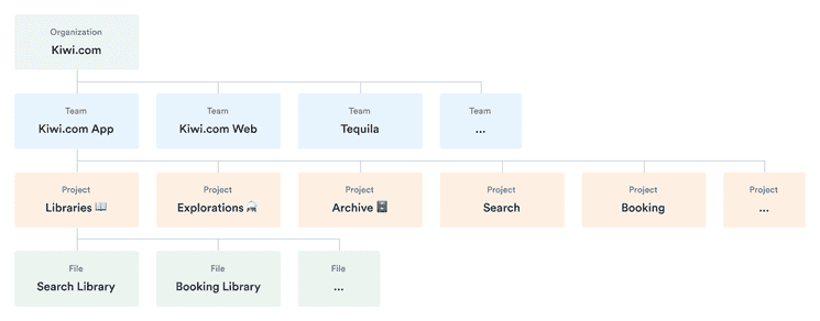
Organization
The Kiwi.com organization is already set up for you and should contain everything you need. If you have any questions about the settings or organization, use the #plz-orbit Slack channel.
Teams
All teams are already set up for you (including separate mobile and desktop teams) and all you have to do is join.
CS Systems All designs files related to our customer support and Balkan
Demo Team Used to demonstrate project and file organization within Figma.
Kiwi.com App Design files for native apps.
Kiwi.com Web Design files for Kiwi.com website. Including both responsive and desktop designs.
Messaging Everything related to user messaging like e-mails, Facebook Messenger, etc.
Orbit Everything related to our design system, from UI kit to assets for orbit.kiwi documentation.
Service Design Mapping customer journeys and service blueprints.
Tequila Design files for our B2B platform Tequila.
Projects
Each project should have a description of what it contains.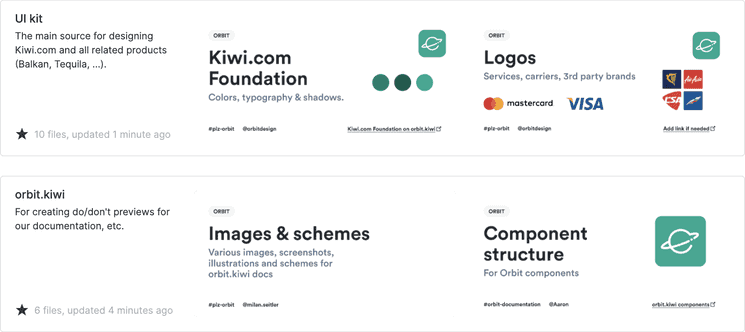
Create projects to represent specific areas within each team. For example, Booking would be a separate project within both Kiwi.com App and Kiwi.com Web. To connect related projects between the app and web teams, you can link the designs together. Add a short description for each project.
Standard projects
Each team has a set of standard projects.
Libraries 📖
Every complex project should have its own library of common elements. This helps keep common elements same across all design files within the project. Designers can then focus on designing specific features in each file without the need to recreate basic elements or use screenshots. See, for example, the Booking library. Each library file has a responsible maintainer (such as \@henne for the Booking library).
An example component inside the native Booking library.
Explorations ⚗️
Each team has a specific project for explorations. This is a good place to try out new concepts and see which ideas work. Keeping explorations separate like this ensures that your core Figma files doen’t grow in size over time and that you can clearly separate the discovery and delivery phases of your design process.
Archive 🗄️
Move old, completed, or outdated files here. If a feature gets designed, developed, and released, you can move it to the Archive 🗄️ project so the original project remains uncluttered. When archiving a file, rename it following the pattern [\<ProjectName>] \<FileName> (for example, [Search] Travel Restrictions).
Proper naming makes the archive easy to scan.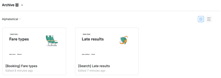
Each team also has auto-enabled libraries to ensure the proper components and styles are readily available.
Files
Files represent a specific feature or functionality. You should create a new file for each new feature, such as sign in, seating, and baggage. Design both responsive and desktop version in the same file, start with responsive.
For more complex projects, create a file with the main flow (for example, Booking flow) to provide a clear overview and show the general interactions between screens. Create new smaller files for specific features (such as Travel Insurance).
Use tags to describe your design files.
- [Main flow]
- [Feature]
- [Usability testing]
Using tags makes it easier to scan files inside a project.
Inside files
The information below is in the process of review and may be updated.
Pages
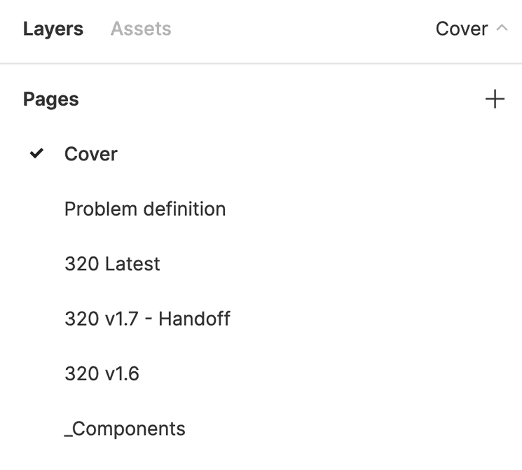
Inside your files, you have various kinds of pages. Give them each a clear name to indicate their type.
Cover
Each file should include a cover page. This special kind of page presents a clear overview of the file’s contents and informs about the owner of the file. Using covers also makes project’s overview less cluttered. It’s not necessary to have cover page as the first page in the file.
Follow these steps to create a cover page: (video tutorial)
- Create a new page in your file and name it
Cover. - Set the background color of this page to
#ffffff. - Find the
File covercomponent via the Asset tab and insert it into the page. - Wrap the component into a Frame (Cmd+Option+G) and name it
Cover. - Edit the contents of your cover. Replace the illustration with custom graphics if needed.
- Right-click the Cover frame and select the
Set as Thumbnailoption.
Covers make it easier to understand the contents of each file.
Design iterations
Each iteration of your designs should have its own page. Name each iteration with a version number to track progress.
Make sure each iteration is clearly structured by using a Header component from the Helpers library, which is automatically included in each team (see an example header in our demo project).
Covers make it easier to understand the contents of each file.
Your Header can introduce the overall feature covered by the page and give a sense of what it covers. You can even show multiple statuses, such as when the design is ready but the copy still needs review.
Handoff
When you have a version ready for development, mark it clearly to show what’s ready for handoff (such as in its name “NPS v1.6—Handoff”). Use this page when handing off designs for development.
Who benefits from the handoff page?
| Developers | Designers | PMs, QA, … |
|---|---|---|
| 👨💻 | 👩🎨 | 🧙♂️ |
| To access design handoffs, see how it all relates, and know what’s ready for development. | To find the latest iteration to extend or reuse it in their designs. | To find the latest iteration in order to see what may be missing from the designed flows. |
Remove old iterations
While it’s possible to have multiple iterations and multiple files, we recommend removing any iterations before the latest 2 or 3 iterations from the file by deleting their pages. Files with many pages can slow down people’s work and make it harder for everyone to get to work.
To delete pages but keep the history intact:
- Save the current version to your version history (⌥ + ⌘ + S (Mac)/Ctrl + Alt + S (Windows) or File → Save to Version History).
- Give the version a name
and optionally a description to make it clear what this version contained.
- Example: v 1.6 Redesigned all buttons (This is the version that would be removed.)
- Click Save.
- Right-click on the page you want to delete.
- Select Delete page.
Now anyone can see the previous iterations by viewing the version history, but the initial file load isn’t slowed down by lots of previous work.
Local components
This page contains all reusable components that are only for this file. This helps keep all components together in one place and also prevents them from getting lost when older iterations are deleted.
Groups
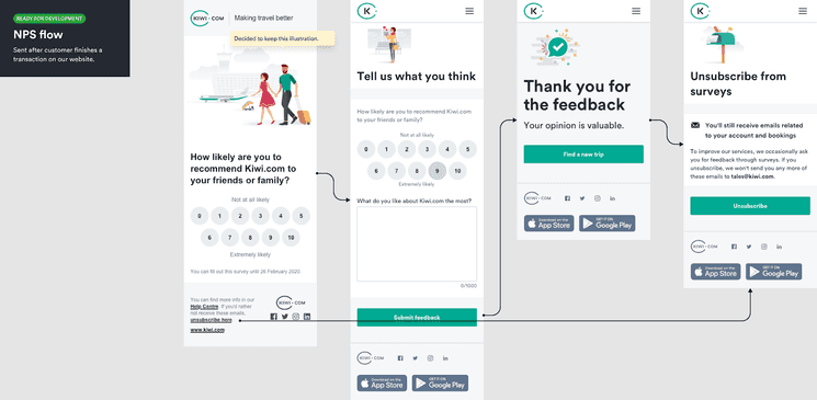
Within a given feature, you might have various flows to design. For example, with a booking, you might have a flow to select a flight and a flow for purchasing the selected flight. You might also have screens that relate to one another but don’t necessarily fit into a flow. In both cases, you can use group screens horizontally to clearly show their relation.
See examples of groups in our demo project.
At the start of each group, you can show the purpose of the group using a Group cover component from the Helpers library, which is automatically included in each team. This cover can show the status of the group along with its purpose so people can easily see why it’s there and where it is in the design process.
Creating flows
To show flows in your groups, we recommend using the Autoflow plugin. This makes it easy to connect screens into a clear flow with a single hotkey.
Screens
Each screen is related to others in its group. If you have some screens that you know will be part of your flow but aren’t ready yet, you can include them with Empty or Missing screen components from the Helpers library, which is automatically included in each team. This clearly shows what your plans are for the future.