When to use
- To keep content off the initial screen but still only a tap away.
- For details not necessary to the main flow.
- To support progressive disclosure.
When not to use
- For structured information to show one section at a time—use an accordion.
- For information and/or actions outside the scope of the screen—use a popover.
- For explanations connected to specific elements—use a tooltip.
- For actions outside the main flow—use a dialog (for simple choices) or a modal (for more structure or options).
Component status
Figma | React | iOS | Android |
|---|---|---|---|
Designing | Released | Released | Released |
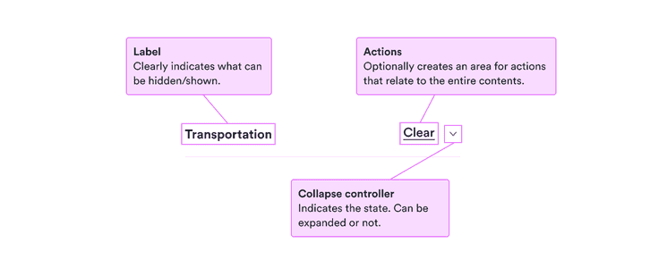
Content structure

Behavior
Use for less essential information
Because it requires an extra interaction, information inside a collapse isn’t be seen by all users. So it’s a great container for extra information that adds context that some users might want but no user absolutely requires.
Don’t use it to hide errors or anything else that might block a user’s flow. Remember that they might not choose to open it.
Content
Make content clear from label
The label is the first thing all users see, and the only thing most of them will see. Make sure it’s clear what the collapse contains so they know whether they want to see more.
Keep the label short but clear. Focus on nouns describing what the collapse contains.
Do
Transport
Stops
Collapse principles
Don’t
What different kinds of transport to search
How many stops are OK?
Read more (about the principles behind collapse components)